
‘The Psychology of Color: How Colors Act on Feelings and Reason’ by Eva Heller, one of my favorite books, has been instrumental in my understanding of color palettes when designing.
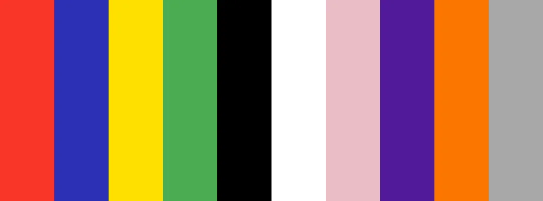
Eva Heller, a German sociologist and psychologist, has devoted her entire career to exploring the connection between colors, emotions, and human behavior. A wide range of combinations is possible with 10 base colors, each with their own variations due to more or less light and each one produce different effects. The following points are a summary of the theory formulated in this book:
1. The color is not neutral
Colors are not just aesthetics; they affect our emotions, thoughts, and decisions. Heller argues that color reactions are cultural, emotional, and psychological, and are often unconscious.
2. Color and feelings are connected
Each color generates coherent and universal emotional associations (although with cultural nuances). For example, red can represent love and passion, but also danger or aggression. Blue conveys both confidence and serenity, as well as coldness or distance.
3. Colors can have both positive and negative connotations
The meaning of a color is determined by the context and how it is combined with other colors.
| Color | Positive meanings | Negative meanings |
| Red | Love, energy, vitality. | Danger, aggression, prohibition. |
| Blue | Confidence, calm, intelligence. | Coldness, melancholy. |
| Yellow | Joy, creativity, optimism. | Envy, jealousy, warning. |
| Green | Nature, hope, balance. | Poison, jealousy, decadence |
| Black | Elegance, power, sophistication | Death, fear, oppression |
| White | Purity, peace, innocence | Emptiness, coldness, sterility |
| Pink | Tenderness, romanticism | Weakness, sentimentality |
| Violet | Spirituality, creativity, nobility | Arrogance, sadness |
| Orange | Energy, enthusiasm, sociability | Superficiality, restlessness |
| Gray | Neutrality, balance | Boredom, indecision |
4. Color combinations are also a means of communication
Heller emphasizes the importance of combining colors to create new meanings. For example:
- Red and Black: aggressive, dominant.
- Blue and White: clean, trustworthy.
- Green and Yellow: natural, fresh.
- Black and Gold: luxurious, elegant.
5. Color symbolism is connected to both personal and collective experiences
Meanings are formed through real-life experiences and learned associations.
- Red is associated with fire and blood, which are both energy and danger.
- The combination of blue with sky and water brings serenity and freshness.
- Green color with nature means life and growth.
6. Colors reflect personality
Heller believes that personality traits can be reflected through one’s favorite colors.
- Blue is the preference of those who seek stability and harmony.
- Red is the color of choice for those who are passionate and active.
- Green color is a favorite color of those who value independence.
- Black color is a preference for those who seek sophistication or an expression of rebellion.
Finally the application of his color theory can be done in:
- Design and branding: consistent visual identity with emotional message.
- Architecture and decoration are spaces that influence mood.
- In advertising and marketing, colors are used to attract or build trust.
- Fashion is a way to express identity and mood through colors and design.
The relationship between color and personality is what interests me the most and is addressed in my portraits. This point will be briefly summarized below.
Colors and Personality

Eva Heller’s work is captivating because it connects the psychology of color to self-expression and personality traits. Heller contends that the colors that are most appealing to someone reveal stable aspects of their character, values, and way of relating to the world.
A favorite color is a way of feeling, thinking, and acting, not just a matter of aesthetic taste. I will explain the relationship between color and personality below:
Blue, stability and confidence
Personality:
- Calm, rational, and loyal people.
- They seek balance, harmony, and truth.
- They tend to be introspective and trustworthy.
- They dislike conflict or improvisation.
Emotional motivation:
- Their desire is for order, serenity, and security.
- They are of the opinion that things should be done well rather than quickly.
Application in design, branding & art:
- Blue connects with trust, which is ideal for conveying professionalism and reliability (which is why banks and technology companies use it).
Red, energy and passion
Personality:
- Impulsive, lively, intense.
- Loves action, risk, and challenges.
- Individuals who are emotionally invested and aim to leave their mark.
- They have the potential to be temperamental and dominant.
Emotional motivation:
- Their desire is to live intensely and feel powerful.
- The color red symbolizes desire, conquest, and life force.
Application in design, branding & art:
- It creates a feeling of dynamism, urgency, passion, or danger. It is used to draw immediate attention.
Green, independence and balance
Personality:
- Self-confident people who value freedom and authenticity.
- They enjoy nature, natural things, and simplicity.
- They seek inner stability and emotional balance.
- They have empathy, but they don’t let themselves be dominated.
Emotional motivation:
- Their needs include autonomy, coherence, and serenity.
- Green represents self-affirmation and personal harmony.
Application in design, branding & art:
- Sustainability, health, and growth are all represented by it.
Yellow, optimism and curiosity
Personality:
- Cheerful, imaginative, and communicative people.
- They love ideas and intellectual challenges.
- They are spontaneous, sociable, and enthusiastic, although sometimes inconsistent.
Emotional motivation:
- Their desire is for happiness, creativity, and recognition.
- Yellow is associated with quick thinking and a sense of humor.
Application in design, branding & art:
- Yellow represents the combination of youth, innovation, and mental energy.
Black, power and introspection
Personality:
- Deep, reserved, and perfectionist people.
- They seek control, authority, and elegance.
- They tend toward critical thinking and emotional independence.
- At times, they wear black to protect their vulnerability.
Emotional motivation:
- Their autonomy, respect, and own space are essential for them.
- Black is a color that conveys sophistication and inner strength.
Application in design, branding & art:
- Black represents luxury, exclusivity, and mystery.
White, purity and order
Personality:
- Meticulous, ethical people with high ideals.
- They love clarity, cleanliness, and sincerity.
- They seek perfection and spiritual balance.
Emotional motivation:
- Their desires are for peace, transparency, and simplicity.
- Beginning, neutrality, and renewal are all represented by the color white.
Application in design, branding & art:
- White represents minimalism, clarity and honesty.
Violet, spirituality and creativity
Personality:
- Dreamers, sensitive, and artistic.
- They have a strong inner life and a developed aesthetic perception.
- They seek meaning, beauty, and emotional depth.
- They may appear reserved or melancholic.
Emotional motivation:
- They want to transcend common reality by connecting the emotional with the intellectual.
Application in design, branding & art:
- Violet represents luxury, wisdom, mystery and spirituality.
Orange, sociability and vitality
Personality:
- Extroverted, active, and optimistic.
- They love to share, motivate, and celebrate.
- They have great energy, but can be impulsive.
Emotional motivation:
- Pleasure, recognition, and companionship are the things they yearn for.
- The energy of red and the joy of yellow are combined in orange.
Application in design, branding & art:
- Orange represents closeness, enthusiasm, dynamism.
Pink, tenderness and sensitivity
Personality:
- Empathetic, caring, idealistic.
- Their emotional capacity is high and they have a sense of beauty.
- Their values include kindness, harmony, and emotional bonds.
Emotional motivation:
- Their desire is for love, emotional security, and understanding.
- Affection and compassion are associated with the color pink.
Application in design, branding & art:
- Pink represents sweetness, empathy, care.
Gray, prudence and reserve
Personality:
- Realistic, analytical, and discreet people.
- Their preference is to observe before taking action.
- Their goal is not to stand out, but rather to maintain balance.
Emotional motivation:
- Control, stability, and emotional neutrality are what they are looking for.
- Gray is a symbol of maturity and protection from excess.
Application in design, branding & art:
- Gary represents professionalism, neutrality and sobriety.
In a future post, I will also show another aspect of Heller’s theory that I find very interesting: the association between color and feelings.